Cloudflare Radar showcases global Internet traffic patterns, attack activity, and technology trends and insights. It is powered by data from Cloudflare’s global network, as well as aggregated and anonymized data from Cloudflare’s 1.1.1.1 public DNS Resolver, and is built on top of a rich, publicly accessible API. This API allows users to explore Radar data beyond the default set of visualizations, for example filtering by protocol, comparing metrics across multiple locations or autonomous systems, or examining trends over two different periods of time. However, not every user has the technical know-how to make a raw API query or process the JSON-formatted response.
Today, we are launching the Cloudflare Radar Data Explorer, which provides a simple Web-based interface to enable users to easily build more complex API queries, including comparisons and filters, and visualize the results. And as a complement to the Data Explorer, we are also launching an AI Assistant, which uses Cloudflare Workers AI to translate a user’s natural language statements or questions into the appropriate Radar API calls, the results of which are visualized in the Data Explorer. Below, we introduce the AI Assistant and Data Explorer, and also dig into how we used Cloudflare Developer Platform tools to build the AI Assistant.
Ask the AI Assistant
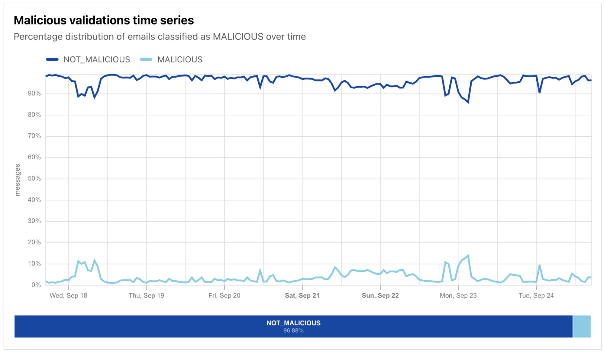
Sometimes, a user may know what they are looking for, but aren’t quite sure how to build the relevant API query by selecting from the available options and filters. (The sheer number may appear overwhelming.) In those cases, they can simply pose a question to the AI Assistant, like “Has there been an uptick in malicious email over the last week?” The AI Assistant makes a series of Workers AI and Radar API calls to retrieve the relevant data, which is visualized within seconds:
The AI Assistant pane is found on the right side of the page in desktop browsers, and appears when the user taps the “AI Assistant” button on a mobile browser. To use the AI Assistant, users just need to type their question into the “Ask me something” area at the bottom of the pane and submit it. A few sample queries are also displayed by default to provide examples of how and what to ask, and clicking on one submits it.
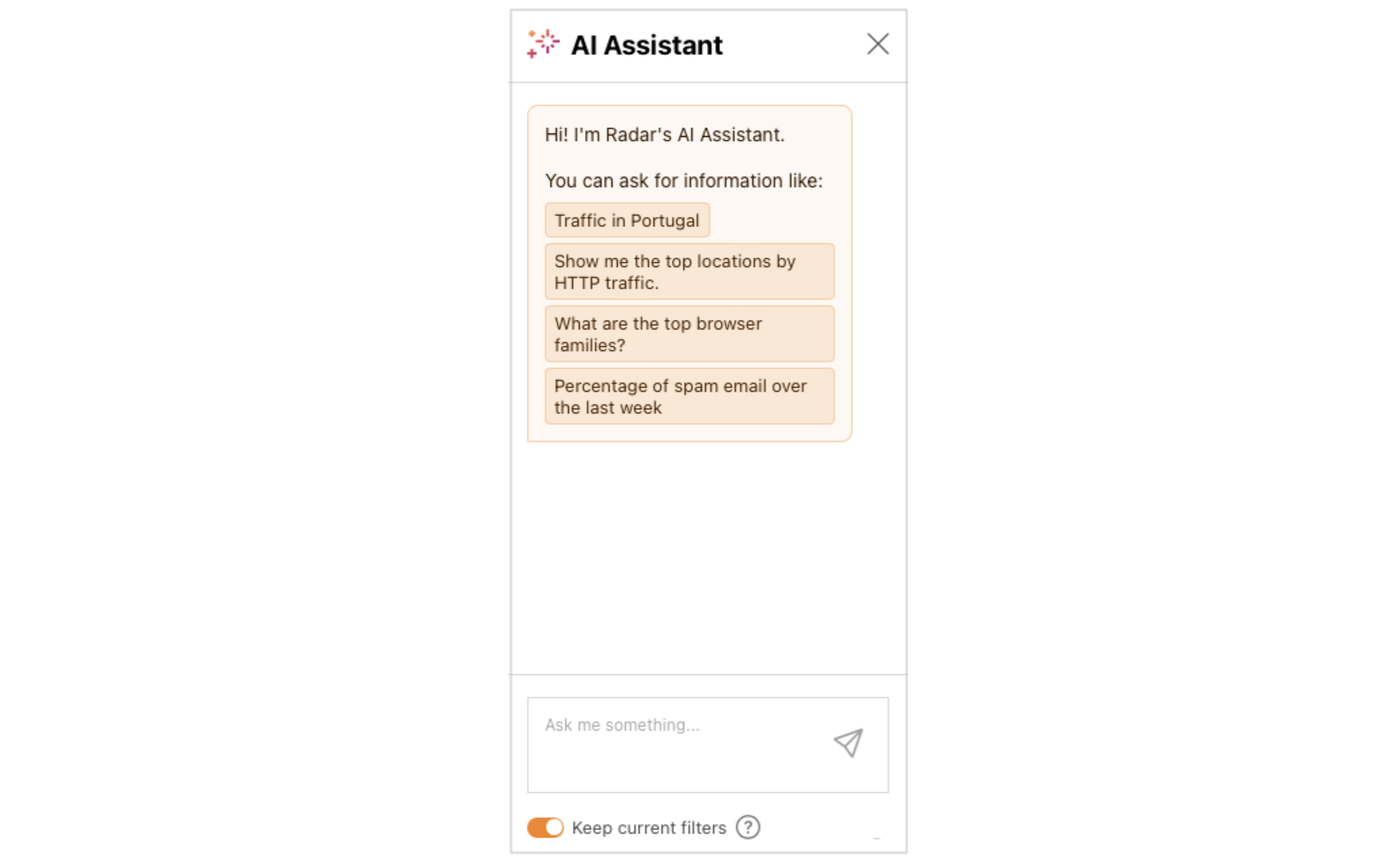
The submitted question is evaluated by the AI Assistant (more below on how that happens), and the resulting visualization is displayed in the Results section of the Data Explorer. In addition to the visualization of the results, the appropriate Data, Filter, and Compare options are selected in the Query section above the visualization, allowing the user to further tune or refine the results if necessary. The Keep current filters toggle within the AI Assistant pane allows users to build on the previous question. For example, with that toggle active, a user could ask “Traffic in the United States”, see the resultant graph, and then ask “Compare it with traffic in Mexico” to add Mexico’s data to the graph.
Building a query directly
For users that prefer a more hands-on approach, a wide variety of Radar datasets are available to explore, including traffic metrics, attacks, Internet quality, email security, and more. Once the user selects a dataset, the Breakdown By: dropdown is automatically populated with relevant options (if any), and Filter options are also dynamically populated. As the user selects additional options, the visualization in the Result section is automatically updated.
In addition to building the query of interest, Data Explorer also enables the user to compare the results, both against a specific date range and/or another location or autonomous system (AS). To compare results with the immediately previous period (the last seven days with the seven days before that, for instance), just toggle on the Previous period switch. Otherwise, clicking on the Date Range field brings up a calendar that enables the user to select a starting date — the corresponding date range is intelligently selected, based on the date range selected in the Filter section. To compare results across locations or ASNs, clicking on the “Location or ASN” field brings up a search box in which the user can enter a location (country/region) name, AS name, or AS number, with search results updating as the user types. Note that locations can be compared with other locations or ASes, and ASes can be compared with other ASes or locations. This enables a user, for example, to compare trends for their ISP with trends for their country.

Visualizing the results
Much of the value of Cloudflare Radar comes from its visualizations – the graphs, maps, and tables that illustrate the underlying data, and Data Explorer does not disappoint here. Depending on the dataset and filters selected, and the volume of data returned, results may be visualized in a time series graph, bar chart, treemap, or global choropleth map. The visualization type is determined automatically based on the contents of the API response. For example, the presence of countryalpha2 keys in the response means a choropleth map will be used, the presence of timestamps in the response means a line graph (“xychart”) should be shown, and more than 40 items in the response selects a treemap as the visualization type.
To illustrate the extended visualizations available in Data Explorer, the figure below is an expanded version of one that would normally be found on Radar’s Adoption & Usage page. The “standard” version of the graph plots the shares of the HTTP versions over the last seven days for the United States, as well as the summary share values. In this extended version of the graph generated in the Data Explorer, we compare data for the United States with HTTP version share data for AS701 (Verizon), for both the past seven days and the previous seven-day period. In addition to the comparisons plotted on the time series graph, the associated summary values are also compared in an accompanying bar chart. This comprehensive visualization makes comparisons easy.
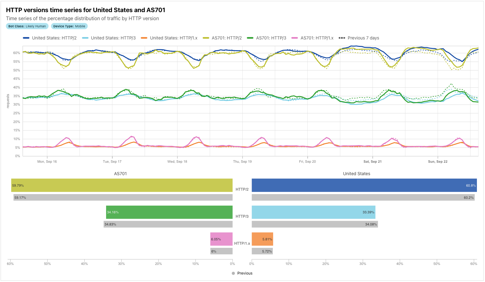
For some combinations of datasets/filters/comparisons, time series graphs can get quite busy, with a significant number of lines being plotted. To isolate just a single line on the graph, double-click on the item in the legend. To add/remove additional lines back to/from the graph, single-click on the relevant legend item.
Similar to other visualizations on Radar, the resulting graphs or maps can be downloaded, copied, or embedded into another website or application. Simply click on the “Share” button above the visualization card to bring up the Share modal dialog. We hope to see these graphs shared in articles, blog posts, and presentations, and to see embedded visualizations with real-time data in your portals and operations centers!
Still want to use the API? No problem.
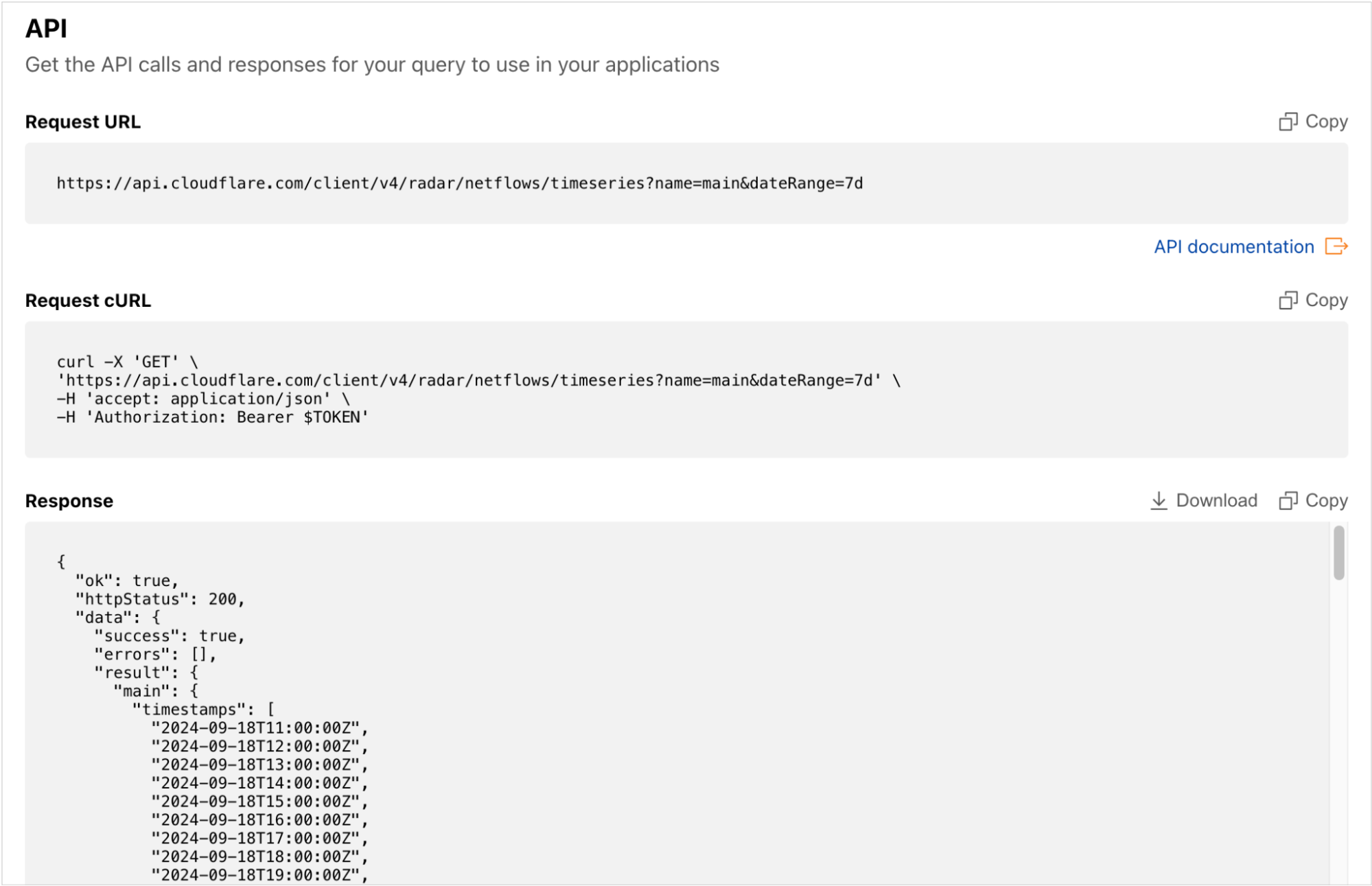
Although Data Explorer was designed to simplify the process of building, and viewing the results of, more complex API queries, we recognize that some users may still want to retrieve data directly from the API. To enable that, Data Explorer’s API section provides copyable API calls as a direct request URL and a cURL command. The raw data returned by the query is also available to copy or download as a JSON blob, for those users that want to save it locally, or paste it into another application for additional manipulation or analysis.
How we built the AI Assistant
Knowing all that AI is capable of these days, we thought that creating a system for an LLM to answer questions didn’t seem like an overly complex task. While there were some challenges, Cloudflare’s developer platform tools thankfully made it fairly straightforward.
LLM-assisted API querying
The main challenge we encountered in building the API Assistant was the large number of combinations of datasets and parameters that can potentially be visualized in the Data Explorer. There are around 100 API endpoints from which the data can be fetched, with most able to take multiple parameters.
There were a few potential approaches to getting started. One was to take a previously trained LLM and further train it with the API endpoint descriptions in order to have it return the output in the required structured format which would then be used to execute the API query. However, for the first version, we decided against this approach of fine-tuning, as we wanted to quickly test a few different models supported by Workers AI, and we wanted the flexibility to easily add or remove parameter combinations, as Data Explorer development was still under way. As such, we decided to start with prompt engineering, where all the endpoint-specific information is placed in the instructions sent to the LLM.
Putting the full detailed description of the API endpoints supported by the Data Explorer into the system prompt would be possible for an LLM with a larger context window (the number of tokens the model takes as input before generating output). Newer models are getting better with the needle in a haystack problem, which refers to the issue whereby LLMs do not retrieve information (the needle) equally well if it is placed in different positions within the long textual input (the haystack). However, it has been empirically shown that the position of information within the large context still matters. Additionally, many of the Radar API endpoints have quite similar descriptions, and putting all the descriptions in a single instruction could be more confusing for the model, and the processing time also increases with larger contexts. Based on this, we adopted the approach of having multiple inference calls to an LLM.
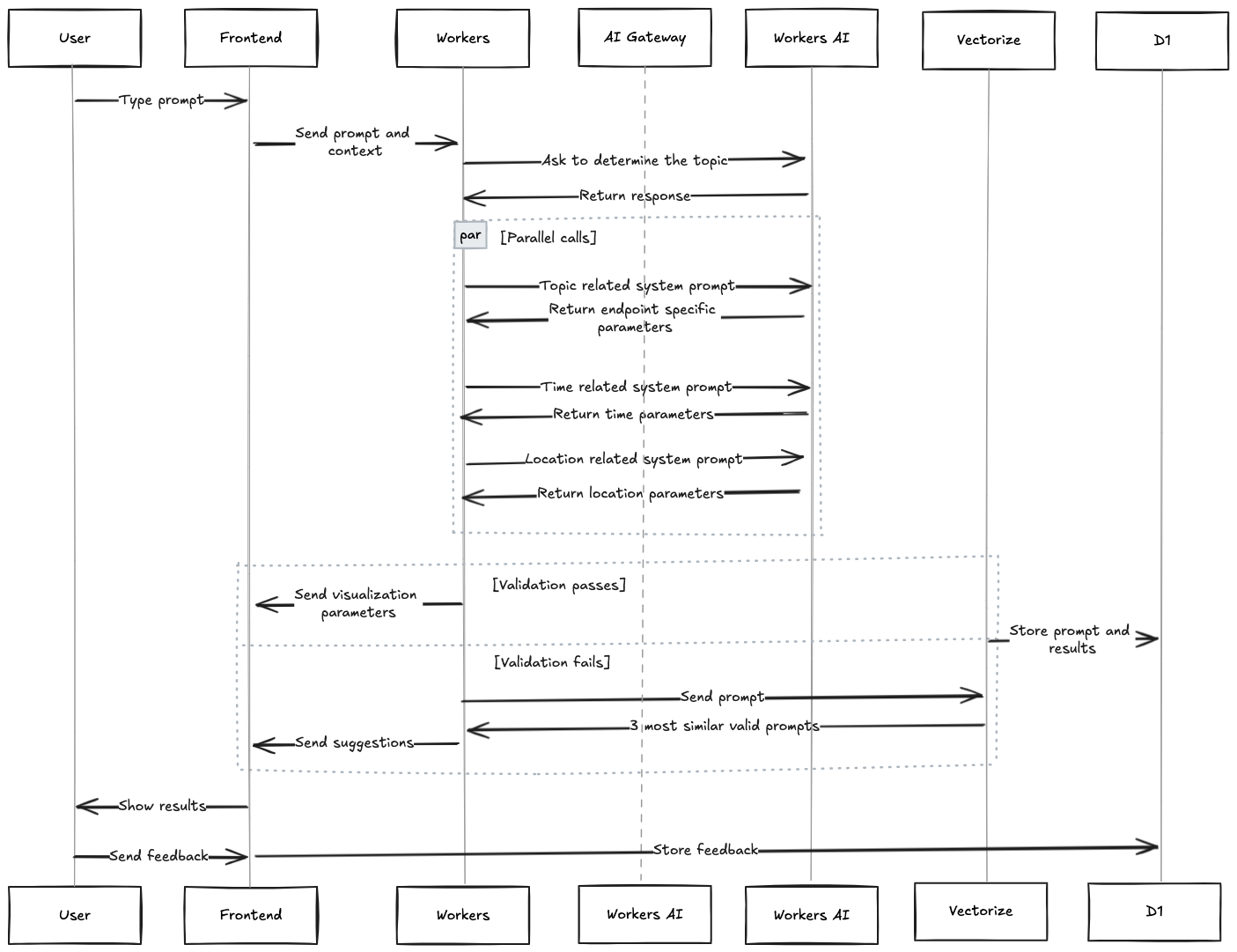
First, when the user enters a question, a Worker sends this question and a short general description of the available datasets to the LLM, asking it to determine the topic of the question. Then, based on the topic returned by the model, a system prompt is generated with the endpoint descriptions, including only those related to the topic. This prompt, along with the original question, is sent to the LLM asking it to select the appropriate endpoint and its specific parameters. At the same time, two parallel inference calls to the model are also made, one with the question and the system prompt related to the description of location parameters, and another with the description of time range parameters. Then, all three model outputs are put together and validated.
If the final output is a valid dataset and parameter combination, it is sent back to the Data Explorer, which executes the API query and displays the resulting visualization for the user. Different LLMs were tested for this task, and at the end, openhermes-2.5-mistral-7b, trained on code datasets, was selected as the best option. To give the model more context, not only is the user’s current question sent to the model, but the previous one and its response are as well, in case the next question asked by the user is related to the previous one. In addition, calls to the model are sent through Cloudflare’s AI Gateway, to allow for caching, rate limiting, and logging.
After the user is shown the result, they can indicate whether what was shown to them was useful or not by clicking the “thumbs up” or “thumbs down” icons in the response. This rating information is saved with the original question in D1, our serverless SQL database, so the results can be analyzed and applied to future AI Assistant improvements.
The full end-to-end data flow for the Cloudflare Radar AI Assistant is illustrated in the diagram below.
When the LLM doesn’t know the answer
In some cases, however, the LLM may not “know” the answer to the question posed by the user. If the model does not generate a valid final response, then the user is shown three alternative questions. The intent here is to guide the user into asking an answerable question — that is, a question that is answerable with data from Radar.
This is achieved using a previously compiled (static) list of various questions related to different Radar datasets. For each of these questions, their embedding is calculated using an embeddings model, and stored in our Vectorize vector database. “Embeddings” are numerical representations of textual data (vectors) capturing their semantic meaning and relationships, with similar text having vectors that are closer. When a user’s question does not generate a valid model response, the embedding of that question is calculated, and its vector is compared against all the stored vectors from the vector database, and the three most similar ones are selected. These three questions, determined to be similar to the user’s original question, are then shown to the user.
There are also cases when the LLM gives answers which do not correspond to what the user asked, as hallucinations are currently inevitable in LLMs, or when time durations are calculated inaccurately, as LLMs sometimes struggle with mathematical calculations. To help guard against this, AI Assistant responses are first validated against the API schema to confirm that the dataset and the parameter combination is valid. Additionally, Data Explorer dropdown options are automatically populated based on the AI Assistant’s response, and the chart titles are also automatically generated, so the user always knows exactly what data is shown in the visualization, even if it might not answer their actual question.
Looking ahead
We’re excited to enable more granular access to the rich datasets that currently power Cloudflare Radar. As we add new datasets in the future, such as DNS metrics, these will be available through Data Explorer and AI Assistant as well.
As noted above, Radar offers a predefined set of visualizations, and these serve as an excellent starting point for further exploration. We are adding links from each Radar visualization into Data Explorer, enabling users to further analyze the associated data to answer more specific questions. Clicking the “pie chart” icon next to a graph’s description brings up a Data Explorer page with the relevant metrics, options, and filters selected.

Correlating observations across two different metrics is another capability that we are also working on adding to Data Explorer. For example, if you are investigating an Internet disruption, you will be able to plot traffic trends and announced IP address space for a given country or autonomous system on the same graph to determine if both dropped concurrently.
But for now, use the Data Explorer and AI Assistant to go beyond what Cloudflare Radar offers, finding answers to your questions about what’s happening on the Internet. If you share Data Explorer visualizations on social media, be sure to tag us: @CloudflareRadar (X), noc.social/@cloudflareradar (Mastodon), and radar.cloudflare.com (Bluesky). You can also reach out on social media, or contact us via email, with suggestions for future Data Explorer and AI Assistant functionality.

Source:: CloudFlare
