Gathering business insights can be a pain, especially when you’re dealing with countless data points. It’s no secret that GPUs can be a time-saver for…
Gathering business insights can be a pain, especially when you’re dealing with countless data points.
It’s no secret that GPUs can be a time-saver for data scientists. Rather than wait for a single query to run, GPUs help speed up the process and get you the insights you need quickly.
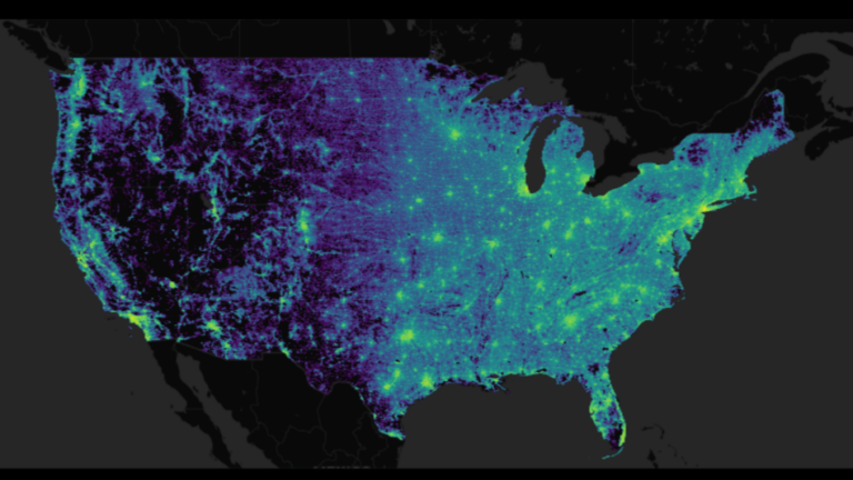
In this video, Allan Enemark, RAPIDS data visualization lead, uses a US Census dataset with over 300 million data points to demo running queries uninterrupted during the analysis process when using RAPIDS cuDF and Plotly Dash.
Key takeaways
- Using cuDF over pandas for millions of data points results in significant performance benefits, with each query taking less than 1 second to run.
- There are several advantages to using integrated accelerated visualization frameworks, such as faster analysis iterations.
- Replacing CPU-based libraries with the pandas-like RAPIDS GPU-accelerated libraries (such as cuDF) helps data scientists swiftly go through the EDA process, as data sizes increase between 2 and 10 GB.
- Visualization compute and render times are brought down to interactive sub-second speeds, unblocking the insight discovery process.
Video 1. Visualizing Census Data with RAPIDS cuDF and Plotly Dash
Summary
Swapping pandas with a RAPIDS framework like cuDF can help speed up data analytics workflows, making the analysis process more effective and enjoyable. Additionally, the RAPIDS libraries make it easy to chart all kinds of data–like time series, geospatial, and graphs–by using simple Python code.
To learn more about speeding up your traditional GPU data science workflows, visit these resources:
- Accelerated data analytics series
- RAPIDS Visualization Guide
- Colab Census Visualization demo
Source:: NVIDIA
